Heeren Brand Design Refresh
Our customer Heeren Zerspanungstechnik is a renowned family-run business with more than 26 years of experience in machining and manufacture of complete assemblies.
With the generation change in company management came a desire to freshen up the brand design. A corporate design that could better move with the times and also find a place at the new company premises was sought.
The envisaged result was a brand design that would communicate both the company’s technical expertise and experience and the fascination with machining that has shaped Heeren Zerspanungstechnik over the years.


Our new brand strategy puts the family name of Heeren in the spotlight, signalling the dawn of a new era for the company.
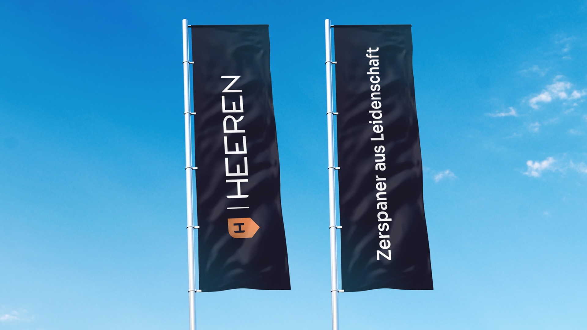
With its industry-atypical, rounded and almost fashionable typography, the word mark combines the female leadership with technological progress in a striking design.
The basis for the pictorial mark is the abstracted shape of a drill, which perfectly captures the form language of our new brand design through clever curves and corners. The ‘H’ from the name is the smallest element, creating the signature anchoring with our brand.
The central message ‘Passionate machinist’ underscores our company’s values and is a clear statement to our customers.


Our design language is marked by clarity and generous use of white space, creating a modern and contemporary look.
To ensure that our new brand is realised consistently, we have created a design guide covering all the important elements we have developed, such as logo basics, pictorial mark, claim, imagery, layout principle and look & feel. We have developed, in addition to business cards and stationery, a straightforward master and an icon set that make achieving a uniform and professional design effortless and efficient.


